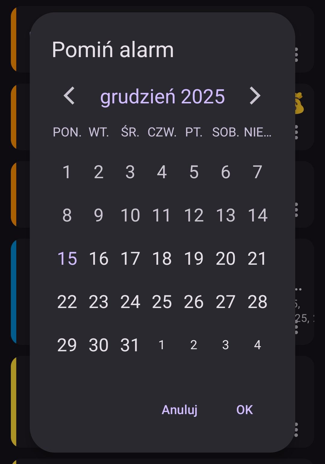
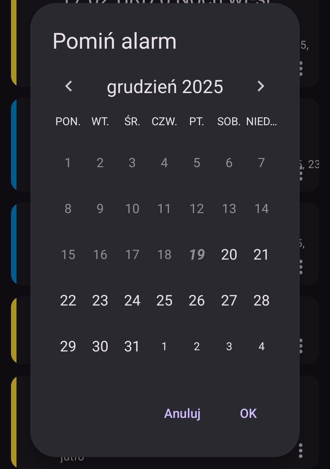
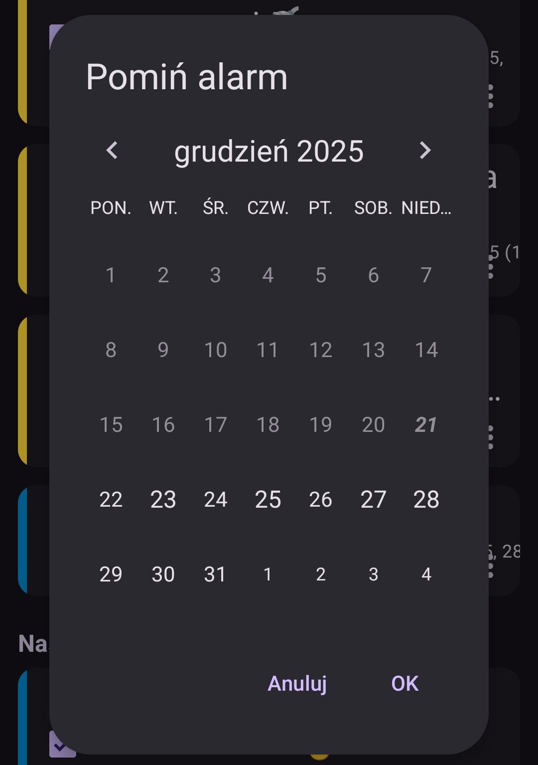
Hi, in version 15.2, in the “Skip Alarm” tab, the calendar doesn’t show marked days with active alarms. In the “Skip/Restore Alarm” tab, the calendar doesn’t show days with missed alarms.
In all calendar views, present day stands out poorly, a pale purple similar to white
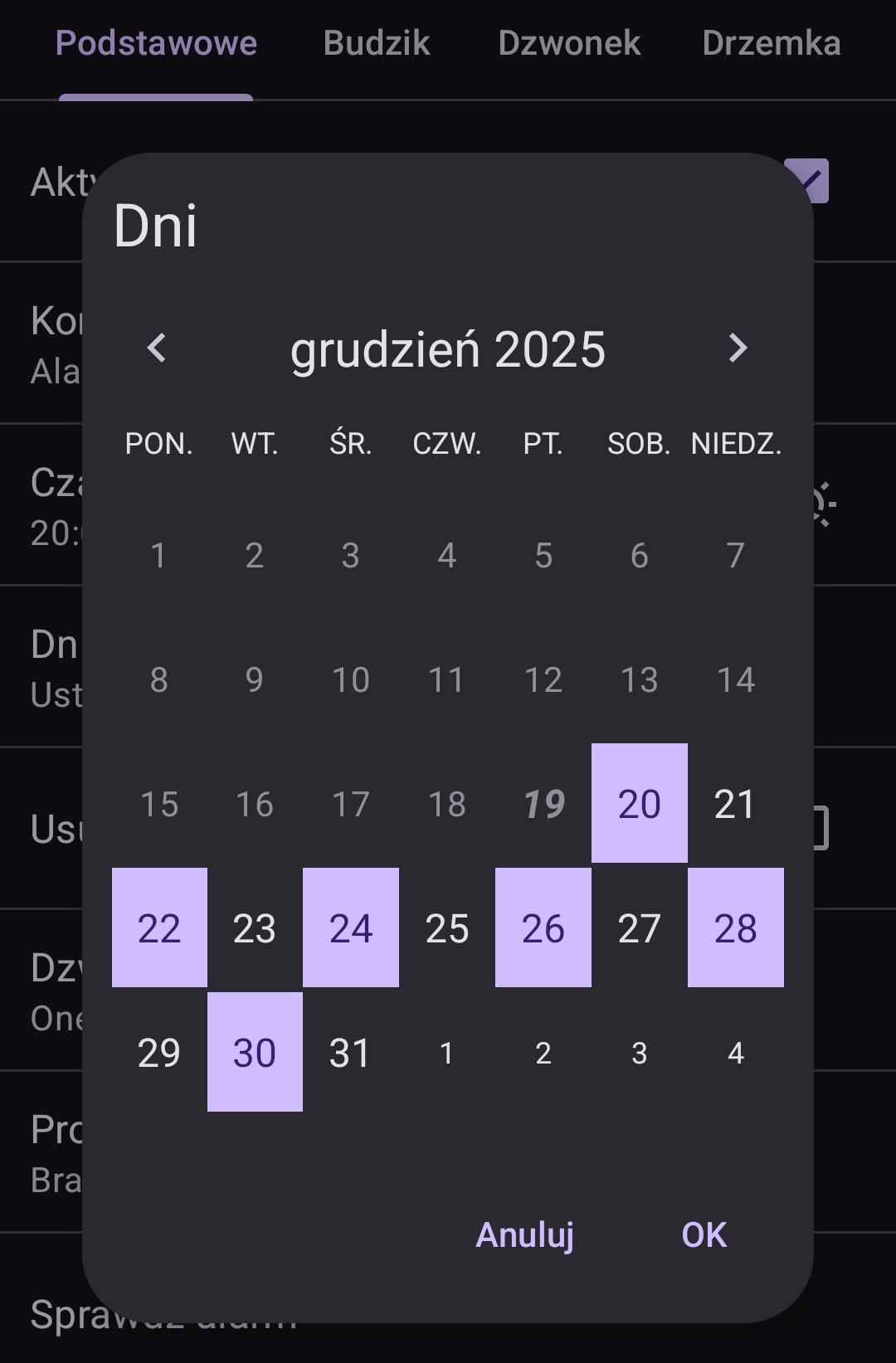
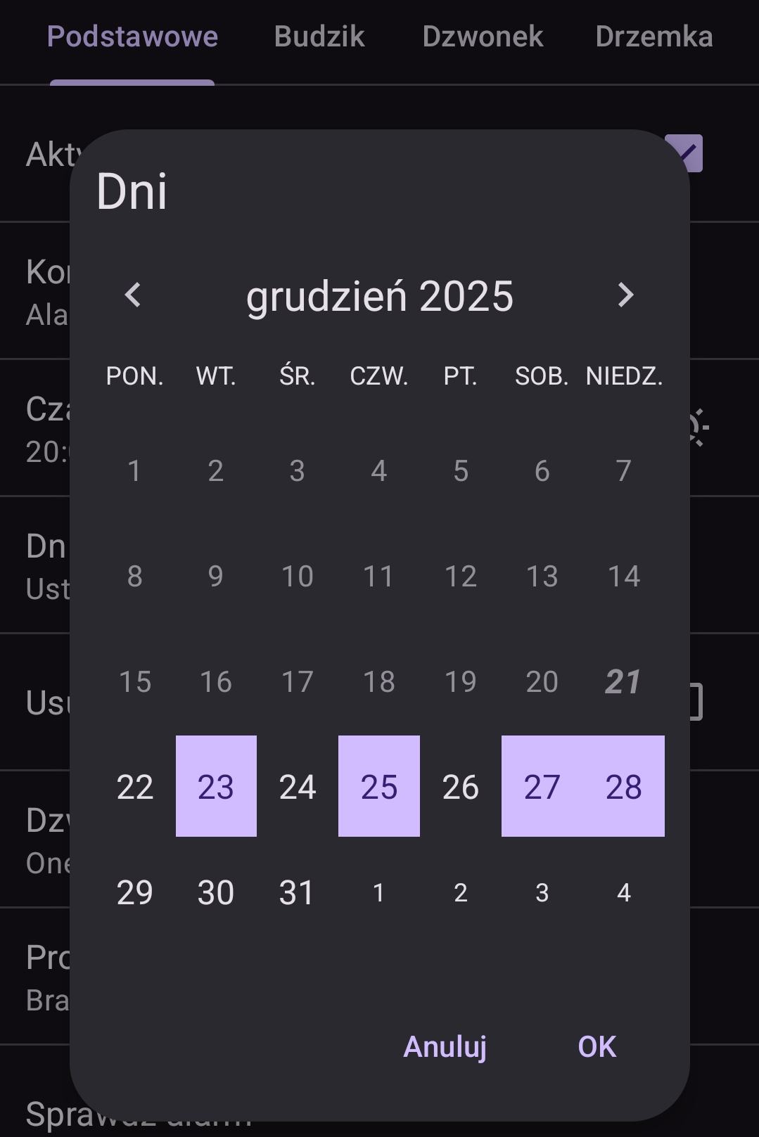
And those new colors aren’t pretty, especially purple button “New alarm”
I have Caynax Alarm v. 15.2 pro, dark skin, Android 15.
To be honest I don’t like buttons colors either. That’s why instead of that material purple style I use so called “Tonal button style”. I’ve decided to no longer go with own styling and stick to the one that Google decided that visually stands out well. And you can see these purple buttons in Google Play app.
That change is also the reason to introduce light (day/night) app theme in next app version.
How can I change the colors in the app, for example, to make today’s calendar day stand out more than the others? Look at the photo above – December 15th is hard to distinguish from the others…
I can see the changes in the “Skip Alarm” tab in the calendar - days with alarms have a bit larger font, but the difference is very small; you have to look closely to see it. A larger, more noticeable difference would be nice, preferably a different font or background color👍